This is Part 2 in our 3-Part series on Federal spending.
Part 1 discussed the severity of the problem by casting the U.S. financial situation within the context of a family household budget. This is an imperfect analogy because a family can’t (shouldn’t) print their own money, but this perspective frames the problem in a more relatable way. Spoiler: It doesn’t look good.
In this Part 2, we’ll discuss the viable options to reduce the deficit, but only briefly, because I have previously written in depth about deficit reduction strategies.1
Financial Tools to Reduce Deficit Spending
Realistically, there are only about nine main concepts we might implement to tackle the deficit. These fall into three broad categories.
A) Increase Revenue
- A.1. Increase Tax Revenues
- A.2. Innovation
- A.3. Sell Government Assets
B) Reduce Spending
- B.1. Reduce Benefits & Entitlements
- B.2. Cut Wasteful Spending
- B.3. Streamline Government Operations
- B.4. Implement Anti-Fraud Measures
C) Debt Management
- C.1. Restructure Debt
- C.2. Inflate the Currency
The good news – fewer variables simplify the problem.
The bad news – we will likely need to implement most, if not all, of these simultaneously. If that is the case, balancing the budget may also imply a prolonged season of austerity, unless coupled with significant economic growth.
Let’s discuss each of these in more detail…
A) INCREASE REVENUE
A.1. Increase Tax Revenues – while this concept is self-explanatory, it’s not entirely clear how politicians can effectively implement this, both functionally and politically. Not only is this a complex problem, increasing taxes does not bode well for the next election cycle.
Further, it’s not as simple as just raising the tax rate. As we will see below, in some cases, lowering tax rates may create offsetting growth, resulting in the same tax revenues collected (longer term). In other cases, tax rates would need to increase to collect more taxes. The implementation is a complex, circular problem, requiring a delicate balance between how much to tax, through what taxing mechanisms, and to whom.
Currently, most Federal tax revenues come from individual income taxes (49%) and corporations (11%).2
Within individuals, there’s an entire spectrum of income ranges to consider. Of course, it is more popular politically to tax the rich, defined as “anyone making more than me”.
Setting aside the idea that it should not fundamentally be the government’s position to extract the maximum amount of wealth from its citizens, if we had to raise more revenue, what does the data tell us about where we are most likely going to be able to do this?
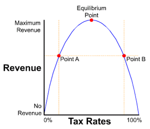
The Laffer Curve is a theoretical model that suggests there is an optimal (equilibrium) tax rate at which tax revenue is maximized. At rates below this optimal point, increasing tax rates increases revenue, while rates above this point cause revenue to decrease as tax rates increase due to reduced economic activity and compliance issues.3 The Laffer curve looks like this:

Determining where the U.S. falls on the Laffer Curve is complex and depends on the structure of the tax system, behavioral responses to tax changes, overall macroeconomic conditions, and many other variables, including their related interactions.
However, we do have somewhat recent data to help us understand how changes in tax rates affect tax revenues. President Trump reduced taxes substantially in 2017 (effective 2018) for both corporations and individuals, with the Tax Cuts and Jobs Act.
We may now look back in hindsight on these tax reductions and learn from the resulting outcomes (sort of… because the years since were also disrupted by Covid and Covid-related changes in economic policy). But, at least directionally, we’d like to better understand the answer to this question – after tax rates were cut, did tax revenues go up, down, or stay the same?
What would you guess happened?
The answer is, “It depends.”
Different tax groups were affected differently and reacted differently, which is interesting. So, let’s delve into this further to see what the raw data tell us.
We should also note this is an imperfect analysis because there are multiple external factors that make it impossible to isolate tax changes as a single variable. (For example, the Fed resumed money printing substantially in 2019 and Covid hit in 2020. Consequently, we can rule out 2020-2023 data as “not useful” for this discussion because the external factors eclipsed the tax change effects for this period). So, there are complications, and the experiment didn’t play out uninterrupted as long as we would have hoped, to gather a full set of data. But we can still look at the 2017-2019 data for clues.
Without a change in tax rates, tax revenues normally scale closely with changes in GDP. Consequently, to assess if tax revenues went up or down, we should really be asking if they went up or down relative to what they would have done with no tax changes and normal historical growth in GDP (because tax changes also affect GDP). Recent historical GDP growth has been ~2.3%.
Here’s the relevant data on U.S. tax revenues collected during Trump’s first term in office (+2016 for reference), broken down by tax source.4 Keep in mind that the tax cuts were implemented in 2018.
I have highlighted and labeled six figures worth discussing.

Six Interesting Data Points
Point (1)
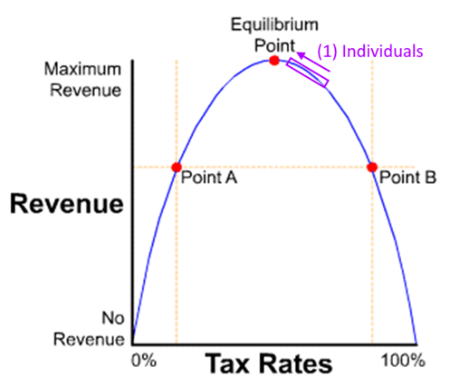
Although taxes were reduced for individual income earners in 2018,5 tax revenues collected increased 6.1%. This is considerably more than the 2.3% increase we would normally expect from general overall growth in GDP.
For individuals, tax rates went down, and tax revenues went up. This suggests that previously, taxes for individuals were to the RIGHT of the equilibrium point on the Laffer curve.

The story might be a little more nuanced if we further divide individuals into high-income and middle-income earners (low-income earners do not typically owe income taxes).6
Point (2)
Taxes collected from Payroll jumped up 6.2% in 2019. This was primarily due to job creation and unemployment dropping to a historically low level of 3.5%. It makes sense this increase was delayed to 2019, as employment statistics took a year to catch up to additional investments made by companies from taxes saved (presumably).
Point (3 & 4)
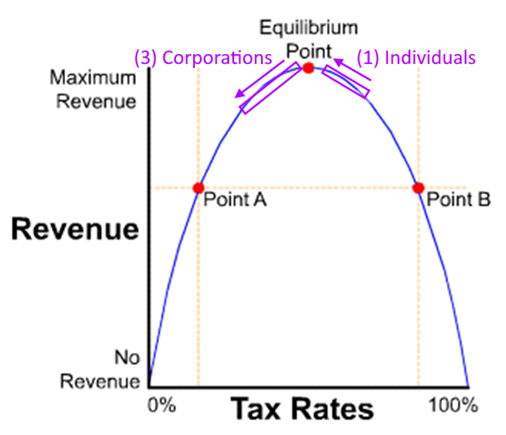
Tax rates for Corporations dropped from 35% to 21% in 2018. In addition, companies were allowed to immediately expense capital investments. The result – taxes collected from corporations dropped by 31% in 2018 (this is huge), followed by a 12% increase in 2019, but did not rebound to anywhere near 2017 levels.
For corporations, tax rates went down, and tax revenues also went down. This suggests that previously, taxes for corporations were to the LEFT of the equilibrium point on the Laffer curve and moved even further LEFT (or were a bit right of the equilibrium point, passed it, and ended up left of it… it’s difficult to say exactly because the tax rate cut was so substantial for corporations).

Caveat – it could be argued there was insufficient time for economic growth to kick in pre-Covid to fully prove this out.
Point (5)
Following a lower-than-expected tax revenue increase in 2018, total tax revenues rose 4% in 2019, driven by higher individual and payroll taxes, which outweighed a significant drop in corporate tax collections.
Point (6)
GDP jumped up in 2018 to 3.0%, a notable shift. GDP is a big number, influenced by a lot of factors. It’s difficult to move the needle on GDP this much.
CONCLUSION for [A.1. Increase Tax Revenues]
While tax revenues in 2018 recorded a modest 0.4% increase, (lower than the 2.3% we might have expected with no tax changes), tax revenues did in fact increase… AND individuals and companies paid lower tax rates. This is a key point.
It would seem the data supports the notion that lowering tax rates freed funds to invest, which produced economic growth and job creation that offset a large portion, but not all, of the tax cuts.
Of course, this comes with notable caveats… that the evaluation duration is rather short (2018-2019) and there may be significant extraneous factors at play. Nevertheless, I think the conclusions are at least directionally correct, which was the aim here.
Can we cut tax rates further and experience the same effect? Likely not. Certainly not for corporations. That part is clear. For individual taxes, my sense is that we are near or perhaps slightly LEFT of the equilibrium point now in 2024.
Personal note – I feel obligated to say that, before this analysis, I generally held the view that we were a good distance LEFT of the equilibrium point on the Laffer curve in aggregate… meaning we could increase tax rates to increase tax revenues.
In fact, when I started writing this post, I assumed the data would prove my previously held opinion, and this would be just a more rigorous analysis to show what I already knew to be true. But, to my surprise, the data showed otherwise. So, I need to admit to myself that I was wrong on this point. While I was correct for Corporate taxes, Individual taxpayers are now much closer to the equilibrium point than I had assumed. The weighted average of these two cases scores my initial assumption about 85% wrong. We should always want to know when we are wrong. Of course, there could be a rational argument for external contributing factors clouding my conclusions, but this seems to be what the raw data is communicating.
Unfortunately, this further complicates the larger problem of the debt. How does the IRS collect more tax revenue if we are near the equilibrium rates already? It’s much simpler to just say, “Raise the rates and get more tax revenue”. Sure, we can probably raise tax rates on corporations a bit, but this will only increase tax revenues incrementally.
If we are already at or near the tax equilibrium point, it would imply that we need to either grow the economy (GDP) much faster, or employ some of the other strategies to tackle the deficit. So, let’s move on to discuss the other strategies.
A.2. Innovation – technology has a 0.5% – 2.0% long-term deflationary effect on the broad economy. This is good because it offsets inflation. However, the effect is not consistent year-to-year. It jumps and stalls over time, with significant delays between capital investments and outcomes, measured in decades.
If we believe the government itself is going to positively affect this, we must also assume the government is a decent capital allocator. It isn’t. However, the government can promote private sector investments in technology. But again, the benefits are often well into the future.
A.3. Sell Government Assets – depending on which assets are included, the U.S. could raise hundreds of billions to over $1 trillion through a strategic, large-scale privatization initiative.
Government assets that might be sold or privatized include:
- Federal real estate
- Federally owned infrastructure (toll bridges, airports, seaports, railways)
- Natural resources (oil and gas reserves, forests, renewable energy assets)
- Utilities (water systems, power plants, transmission lines)
- Public enterprises (Postal Service, Amtrak, broadcasting services)
- Financial assets (government-owned banks, loan portfolios, government sponsored entities)
- Intellectual property (broadcast spectrum, patents)
- Defense and military assets
However, public opposition and long-term economic implications make these options politically challenging to use to reduce the national debt.
Further, proceeds from asset sales and privatizations are one-time inflows, offering only temporary relief for long-term deficits by reducing future interest on retired debt. While potentially significant amounts of money could be raised, the other challenge is that lawmakers may be tempted to offset these gains with increased spending, such is their nature.
B) REDUCE SPENDING
B.1. Reduce benefits and entitlements.
B.2. Cut wasteful spending.
B.3. Streamline government operations to capture operational efficiencies.
B.4. Implement anti-fraud measures in both tax collection and spending programs.
The main purpose of this 3-part series is to focus on the cost-cutting options, and specifically where we should cut spending. That is coming in Part 3, so we’ll not elaborate further on this section for now.
C) DEBT MANAGEMENT
C.1. Restructure Debt – issuing longer duration debt instruments might buy us some time.
C.2. Inflate the Currency – printing money to reduce the real value of debt is a tactic with its own risks and challenges, namely, avoiding asset bubbles and broad-based inflation on goods and services that affect the cost of living for ordinary citizens.
There can also be significant political pressure here as money printing (and increasing the debt) both provide short-term economic highs at the expense of the commensurate withdrawal symptom called inflation.7
So that concludes the outline of the nine available options to address the deficit spending.
Bonus – Increasing Debt & Interest Rates
I should have included this in Part 1, but I didn’t think of it at the time.
One of the challenges of increasing debt is that it is a driver of inflation. Debt infuses more capital into the economy, more capital competing for the same goods and services – hence inflation.
The other challenge is, more debt requires more buyers of that debt. But to curb inflation, the Fed prefers to buy less U.S. debt. Removing or reducing the Fed as a buyer of U.S. debt means we need to attract more interested parties for U.S. treasuries. To do this, the U.S. Treasury effectively must offer a higher interest rate. The obvious problem with a higher interest rate is that it translates to higher future interest payments.
These two factors, more debt and higher interest rates on debt, have a multiplying effect on the annual interest expense we must pay as a nation.
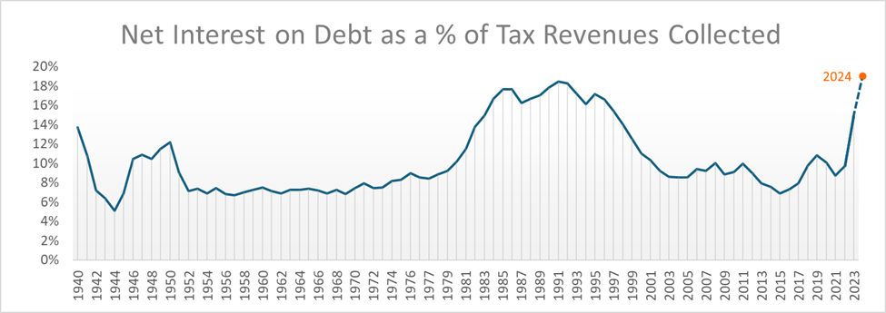
To illustrate this conundrum, I graphed the historical interest expense the U.S. has paid on its debt as a percentage of tax revenue collected from 1940 through 2024. This graph answers the question: What percentage of our taxes go to just interest payments on the debt?8
The answer is, about 18-20% as of 2024, the highest ever and approximately double the long-term historical average of ~10%.

To be clear, these payments do not pay down the debt, just the interest portion.
As older low-interest debt is retired and replaced with higher-rate debt, average interest costs rise. Currently, rates remain tempered by legacy low-interest debt from the past two decades, but without proportional GDP growth, upward pressure on interest expenses will persist.
The last time this ratio was this high was in the 1980s, following stagflation in the late 1970s. To curb inflation, Fed Chair Paul Volcker raised the Fed Funds rate to 20% in 1981! The effects of this are seen as the hump in the graph for the 1980s to early 1990s – a financially challenging period for many.
Summary for Part 2
We have discussed the nine available options to help address the deficit spending issue. However, none of these solutions alone is sufficient to balance the budget, not even close. We must therefore attack the deficit on (almost) all fronts, while navigating the unique challenges of each.
Part 3, Where EXACTLY We Should Cut Government Spending, is coming… but here’s a sneak preview.
Part 3 – Sneak Preview
I sorted the 5,000 line items from the 2025 Federal Budget, from the largest funded item (Social Security at $1.4 trillion) to the smallest items ($1 million each). I have been systematically and painstakingly reviewing each funded item, row-by-row, starting at the top, and making individual judgements on what budget reductions, if any, I would place on the program or service.
I would have preferred a much more granular accounting. Even at 5,000 rows, many of the items include a large set of funded programs within each row. The depth is only four layers deep:
- Agency
- Bureau
- Account
- Subfunction Title
- Account
- Bureau
For example:
- Department of State
- Administration of Foreign Affairs
- Embassy Security, Construction, and Maintenance
- Conduct of foreign affairs
- Embassy Security, Construction, and Maintenance
- Administration of Foreign Affairs
Although I am taking the time to research the details on each funded program that I do not initially understand, some descriptions are too vague to accurately assess exactly what the program is, or is meant to do.
Progress
As of this publish date, I have made my way down the list to those line items that are now below $600 million each. Making 5-10% cuts to programs of this size and smaller doesn’t move the needle much, relative to the size of the overall Budget. But I’m continuing under the assumption that collectively, these add up. Further, I’m finding some of the more egregious wasteful spending in these smaller line items. Perhaps these have faced less scrutiny historically, with fewer eyeballs scanning that far down the list.
More to come, but it’ll take some time to publish Part 3…
Follow Past Midway if you would like an email notification when I post something new.
FOOTNOTES:
- For this statement to be true, you have to concede that ~3,000 words is still considered “brief”.
- Source: U.S. Treasury.
- I previously wrote about this in my post titled: Deficits, Debt, Interest, Taxes, Austerity, Waste, Inflation and The Fed.
- Source: Congressional Budget Office (CBO) (with formatting help from Andy). Download the CBO Excel file.
- The tax brackets for individuals remained the same but the tax rates in each bracket changed…
From these: 10%, 15%, 25%, 28%, 33%, 35%, and 39.6%
To these: 10%, 12%, 22%, 24%, 32%, 35%, 37%.
- I dropped this part to the footnotes because it is more speculative, and less data driven.
High-Income Earners: Marginal tax rates are now likely near the optimal range or slightly to the RIGHT of the equilibrium point. Increasing tax rates on this group would likely discourage investment and lead to lower-than-expected tax revenue gains.
Middle-Income Earners: Marginal tax rates are now likely near the optimal range or slightly to the LEFT of the equilibrium point. Modest increases in taxes for this group might lead to slightly higher revenue without substantially affecting economic activity. Conversely, lowering tax rates for this group would likely lower tax revenues without the corresponding increases in economic activity.
- Too much inflation prevents politicians from being re-elected.
- Source: Govinfo.com. Section 3 – Federal Government Outlays by Function. Table 3.1 – Outlays by Superfunction and Function: 1940-2029 <<< downloads Excel file. Section 2-Composition of Federal Government Receipts. Table 2.1 – Receipts by Source: 1934-2029 <<<downloads Excel file.
Made it though all even with footnotes! 😝
The tax rate data was very interesting – thank you for researching and explaining.
Looking forward to part 3!
As a non-economist/economically-minded-person, i appreciate this breakdown. It seems to me, if i understood everything correctly, that effective options to improve the situation are looking fairly bleak. Not unexpected, but i am interested to read part 3 as to what areas you think we could reduce wasteful spending, as this seems like the largest lever available to pull based on your statements above.
Always interesting, I like your definition of “Rich” (anyone making more than me).
I believe that tax cuts increase revenues, If memory serves me, John Kennedy was the first to demonstrate how well this works.
Thank you for the massive amount of work in this research. I wish there was a way to expose more people to this information.